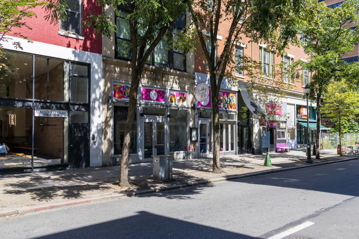
Imagine standing across the street from a typical block of downtown retail. To your left is a corporate bank with 50 feet of unbroken glass. To your right is a chain pharmacy wrapped in massive, illuminated branding. Tucked between them sits a 15-foot independent storefront, desperately trying to be seen.
In my years of designing and installing commercial signs, I watch small business owners try to win this uneven real estate battle by screaming visually. They plaster their narrow windows with neon sale decals, tape up multiple paper menus, and hang oversized vinyl banners from the awning. The result is a chaotic blur that pedestrians tune out.
The lack of square footage isn’t the problem; depth and sightlines are. To stop foot traffic, give people one high-contrast focal point that says who you are before they reach the door.
The stakes are real. A FedEx Office survey found that 76% of consumers have walked into a store they’d never visited because of its signs, while 68% have bought something because a sign caught their eye. A four-year study found that, on average, 54% of shoppers have driven past a business because its sign was too small or unclear.
Let’s list a few creative ways to boost your storefront curb appeal.
1. Dimensional Lettering Pulls Eyes From Down the Block
Flat vinyl lettering slapped onto a painted fascia board can disappear into the background from 30 feet away. Human eyes naturally track shadows and physical depth, which is why individually mounted dimensional letters command attention on a crowded street.
Solid wood, cut acrylic, or cast aluminum letters standing an inch off the wall catch the sun during the day and cast crisp shadows that give a small storefront a permanent, established feel.
I see this happening constantly. A shop owner upgrades from a stretched banner to raised metal letters, and foot traffic ticks upward. The brain registers the business as a permanent neighborhood fixture rather than a pop-up. Once the primary sign has physical depth, how it’s illuminated determines how well it performs after sunset.
Scale matters as much as depth. A common guideline is an inch of letter height per 10 feet of viewing distance, which puts window lettering at 3–5 inches for readers who are 30–50 feet away. Another suggestion is 8- to 12-inch channel letters for streets with two traffic lanes, mounted roughly 10–14 feet up.
2. Warm Backlighting Works Harder Than Harsh Floodlights
A narrow storefront with bright security floods washes out brand colors and makes the entrance feel commercial. Soft, indirect light can draw people in by mimicking the inviting glow of a hospitality space rather than a warehouse loading dock.
Halo-lit signs can solve this: the light washes the wall behind the opaque letters rather than shining directly at the street. This creates a distinct silhouette that remains readable at night without blinding walkers. A well-lit sign is a beacon that shows the space inside is safe, warm, and open for business.
Consistency counts, too. Keep LED color temperature uniform across every lit element, so the sign, blade, and window glow read as one design rather than a patchwork.
| Lighting Approach | Visual Effect | Best Application for Small Footprints |
| Halo (Reverse-Lit) | Soft and elegant outline against the exterior wall | High-end retail, salons, and boutique cafes |
| Gooseneck Fixtures | Vintage, downward beam | Exposed brick facades and traditional awnings |
| Internal Push-Thru | Glowing text pushing through solid metal | Late-night food stops and convenience stores |
| Edge-Lit Acrylic | Subtle glowing borders with unlit faces | Minimalist galleries and modern offices |
While targeted lighting creates an inviting atmosphere, a tiny footprint means you quickly run out of physical space to advertise what you actually sell.
3. Motion Captures Attention When Window Space is Tight
A small display window can’t hold several posters without looking messy, but a screen that changes can. Human peripheral vision is highly sensitive to motion. A shifting screen catches casual glances that a static chalkboard misses.
Swap a taped-up paper menu for a high-resolution digital display sign, and a tiny bakery can move from morning espresso specials to afternoon pastry deals in the same square foot of window.
- Use slow fades so the menu doesn’t feel like a chaotic arcade game.
- Rotate high-contrast images so commuters don’t experience visual fatigue.
- Put dynamic content right behind the storefront glass to pull foot traffic into the shop.
Refresh content on a schedule, too. You can build a window calendar so displays follow seasons, holidays, or local events.
Digital screens communicate changing details inside the glass, but to catch the attention of someone walking parallel to your shop, you need to alter the building’s exterior geometry.
4. Projecting Blade Signs Catch Parallel Sidewalk Traffic
The best-designed flat wall sign remains invisible to a pedestrian walking on your side of the street until they are directly in front of the door. A projecting blade sign mounts at a right angle to the facade, so walkers can spot it from half a block away.
For narrow storefronts, this often delivers a high return on investment. It acts as an early warning system for pedestrians walking briskly. If they don’t know you are there until they are standing on your welcome mat, they have already walked past you.
Projecting signs are especially useful in multi-tenant buildings, where they cut through visual clutter. Because projection limits, permits, and ADA clearance vary by city, confirm local rules before drilling.
Mount a double-sided bracket at least 8 feet off the pavement to clear umbrella height while keeping a simple logo comfortably within the natural eye-line of incoming traffic. With overhead signage successfully stopping traffic, the final step is to soften the hard transition from the concrete sidewalk to your threshold.
5. Intentional Greenery Frames the Entrance Without Blocking Walkways
Concrete façades and metal door frames feel cold, but flanking an entrance with living plants warms things up. You do not need a sprawling patio to introduce organic texture. Two tall, narrow planters positioned tightly against the doorframe add vertical volume. To avoid violating city sidewalk ordinances, keep the walkway clear and check your local rules.
Select structural plants like snake plants, manicured boxwoods, or ornamental grasses to maintain a clean aesthetic that won’t spill over and obscure the curated window display. These natural elements signal to walkers that the space is actively cared for. It builds trust before they touch the handle.
Maintenance matters, as well. Pots of dead flowers undermine credibility, so choose hardy plants and add them to your daily walk-around.
Restraint is the Small Storefront’s Greatest Asset
A tiny storefront is an exercise in visual restraint. The shops that command the most attention on a heavily commercialized block are rarely the ones using every inch of glass to shout at the street. They are the ones using physical depth, warm lighting, perpendicular visibility, and clean motion to guide the pedestrian’s eye naturally toward the door.
To figure out what your facade actually needs right now, walk 50 feet down your street, turn around, and look back at your shop. If your primary sign blends into the brick and your window looks like a flat wall of text, lift your logo off the wall and hang a blade sign over the sidewalk.
Guest author: Charlie Gibson is Senior Executive Vice President at Bootz and Duke Sign Company. Outside of managing accounts of operations and sales in the company, he spends time imparting his knowledge on the Retail and Commercial Sign Package Development as an Arizona Sign Specialist through podcasts and written works.
